Getting started
Primer Web is the Figma library of UI components that our team’s at GitHub use to design for experience for GitHub. The components contained within Primer Web match with what is available for developers in Primer React Components, Primer ViewComponents, and Primer CSS framework.
Design patterns are documented in Primer’s interface guidelines.
How to use
To use Primer Web, publish, if not already available in your list of libraries, and enable from the Assets tab.
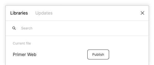
Publish to your Figma instance
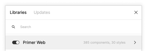
Enable the Primer Web library
🎉 Primer Web is now available to use in your work
Breaking changes
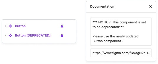
Breaking changes involve a component being either fully reconstructed or a change in its properties. To mitigate these changes, Primer will release new updated components alongside the legacy components under the same name.
Legacy components will have the tag [DEPRECATED] added to the component name as well as a deprecation notice in the component description.
Contributing to Primer Web
Members of GitHub are invited to contribute to Primer Web. When making any additions or changes, please create a branch from Primer Web and name it @username/changes-being-made. Example: @mona/add-new-component.
Authoring components
At GitHub, we have created a set of guidelines that contributors and maintainers can reference when creating and updating components. These guidelines are available to read at our open source repository. Read the authoring guidelines